Mimicking subgrid with display contents
A couple years ago, I read a really good article (I can't remember on what site, unfortunately) that explored the CSS display property at length and what each of its values did.
One of those values I'd never heard of before: contents. It's certainly not as commonly used as block, inline, flex or grid, but it is a powerful option that is well worth being aware of.
Here's Mozilla's description of what happens when you apply display: contents to an element:
These elements don't produce a specific box by themselves. They are replaced by their pseudo-box and their child boxes.
Basically, when display: contents is applied to an element, the browser makes that element disappear and makes child elements move up a level in the DOM.
Make sense? No? Here's an example:
<p>This is a paragraph.</p>

<div style="display: contents;">
    <h2>Nested list</h2>
    <ul>
        <li>Item one</li>
        <li>Item two</li>
        <li>Item three</li>
    </ul>
</div>
Will be interpreted by the browser as this:
<p>This is a paragraph.</p>

<h2>Nested list</h2>
<ul>
    <li>Item one</li>
    <li>Item two</li>
    <li>Item three</li>
</ul>
The browser acts as if the div isn't even there. Any background, border and padding the div has will not be rendered (inherited properties such as colour and font will still effect child elements).
Why is this useful?
Ultimately, this is about semantics. Rachel Andrew, as always, did a great job of explaining it at length in her Vanishing boxes with display contents article:
This value becomes useful if you want to add some element because it makes sense in terms of document semantics, but doesn’t in terms of display. Perhaps you have some content that makes sense marked up as an article, that article is then a flex item in your layout BUT the elements you really would like to be flex items are nested inside that article. Rather than flattening your markup and remove the article element to enable these inner elements to be part of the flex layout, you could remove the boxes generated by article using display: contents. You then get the best of both worlds, semantic markup plus the visual display your design requires. That sounds good to me.
So, you can include elements for semantics and then get the browser to ignore them - this is really cool. Let's take a look at an example in the wild: ethanmarcotte.com.
A recent Sidebar.io email took me to Ethan's website and after reading the article he'd written, I was intrigued by the site layout so I started poking around in dev tools to see what was going on.

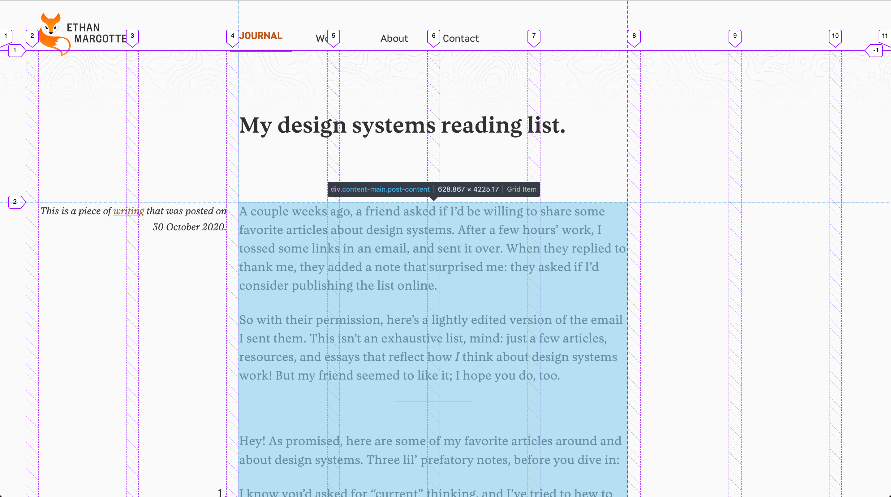
.post-content using Firefox dev tools. Notice how the whole blue area is just one grid row.
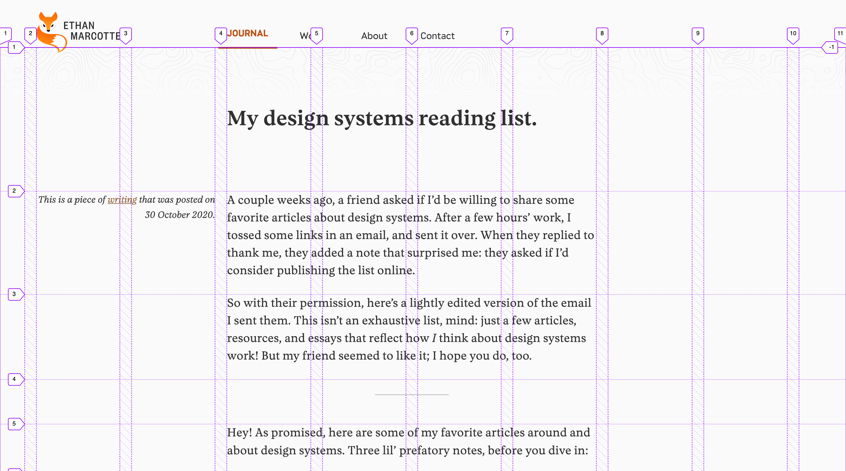
display: contents to remove .post-content from the DOM and letting the child elements take its place. See how each of the child elements now have their own row within the grid.Being able to let the children of an element inherit their parent's position in the DOM is an extremely useful tool to have at your disposal.
The power of display: contents didn't really click for me until I saw it used with CSS grid on Ethan's site. When used together in this way, a grid item's children can also be grid items and inherit the grid tracks.
This is an excellent solution to a feature that is currently missing from CSS Grid Layout: subgrid.
What is subgrid?
I've tried explaining this in my own words but I can't do it in a simpler way than MDN web docs, so I'm going to lean on their excellent description:
When you add
display: gridto a grid container, only the direct children become grid items and can then be placed on the grid that you have created. The children of these items display in normal flow.You can "nest" grids by making a grid item a grid container. These grids however are independent of the parent grid and of each other, meaning that they do not take their track sizing from the parent grid. This makes it difficult to line nested grid items up with the main grid.
If you set the value
subgridongrid-template-columns,grid-template-rowsor both, instead of creating a new track listing the nested grid uses the tracks defined on the parent.For example, if you use
grid-template-columns: subgridand the nested grid spans three column tracks of the parent, the nested grid will have three column tracks of the same size as the parent grid. Gaps are inherited but can also be overridden with a different gap value. Line names can be passed from the parent into the subgrid, and the subgrid can also declare its own line names.
So, let's recap:
subgridallows an element to inherit grid columns and rows from its parentdisplay: contentslets child elements take the place of their parent in the DOM
Why aren't we using subgrid then?
Level 2 of the CSS Grid Layout specification is currently a working draft and the only browser that supports it is Firefox. Bummer.
For now we're stuck using display: contents as a clever workaround on our grid layouts, but I hope we don't have to wait too long to see subgrid support in other browsers.