CSS repeatable linear gradients on multiple lines of text
On a recent client project, I wanted to style the page headings with a vertical gradient. Adding linear gradients to text is really easy - you can do it with just a few lines of CSS:
h1 {
    background-image: linear-gradient(
        to bottom,
        rgb(255, 255, 255),
        rgb(100, 100, 100)
    );

    -webkit-background-clip: text;
    -webkit-text-fill-color: transparent;
}90deg, 180deg, and to top are all valid options for making a vertical gradient, too. I chose to use to bottom because it's more descriptive and allows me to order the gradient colours in my code in the same top-to-bottom order rendered on the page.This gives us this:
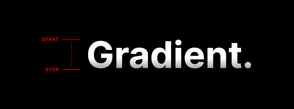
That looks great. But, there's a problem. If the heading wraps onto multiple lines - which it could do if the heading is very long or the page is viewed on a small screen - then this happens:
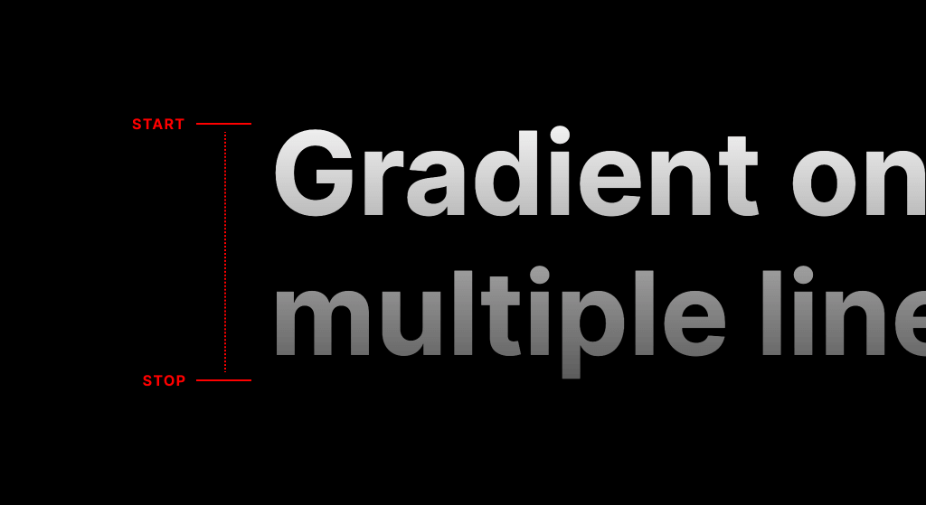
The gradient will stretch from the top of the first line to the bottom of the second line.
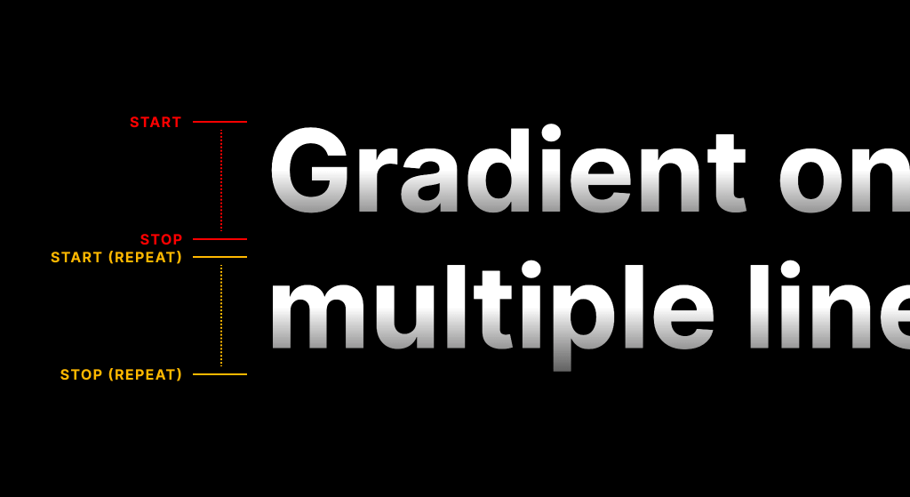
Repeating linear gradients
Fortunately, we can repeat our linear gradient using the aptly named repeating-linear-gradient CSS function.
With a repeating linear gradient, we can define the size of our gradient using colour stops, but the gradient will be repeated infinitely in the specified direction until it covers its entire container.
h1 {
    background: repeating-linear-gradient(
        to bottom,
        rgba(255, 255, 255, 1) 0,
        rgba(255, 255, 255, 1) 1.2em
    );

    -webkit-background-clip: text;
    -webkit-text-fill-color: transparent;
}
Colour stops can be defined in px, %, or em. In the example above, I'm using em's. When adding gradients to text, using em's is particularly beneficial because we can ensure that our gradient is sized relative to the font size. If you change the font size at a later date, the gradient will scale up or down with the font size.
Match line-height and colour stop values
If you want to make life easier for yourself, make your line-height and final gradient colour stop values match. This will ensure your repeating gradient is always the same height as the line-height.
h1 {
    line-height: 1.2;

    background: repeating-linear-gradient(
        to bottom,
        rgba(255, 255, 255, 1) 0,
        rgba(100, 100, 100, 1) 1.2em
    );

    -webkit-background-clip: text;
    -webkit-text-fill-color: transparent;
}1.2 is equal to the repeating gradient stop colour value of 1.2em.Note: this won't work on shorter line-height values (less than 1.1) because the gradient won't be tall enough to cover any descenders in your text. Always use text with a good mix of ascenders and descenders when defining your gradient.
Remove clipping to see what's going on
If you remove/comment out both the -webkit-background-clip and -webkit-text-fill-color attributes, your repeating linear gradient will appear behind your text. This is a great way to help you see how and where the gradient repeats itself.
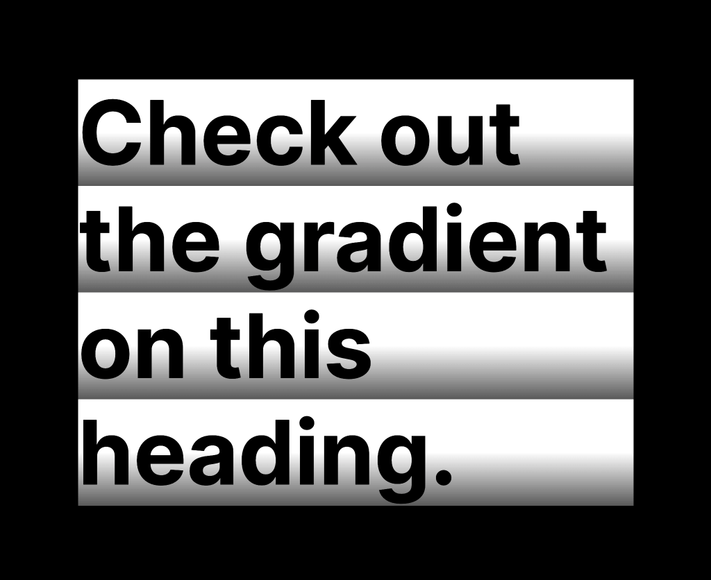
If your text colour is similar to the gradient, you may want to temporarily switch to a colour that has more contrast against the gradient.