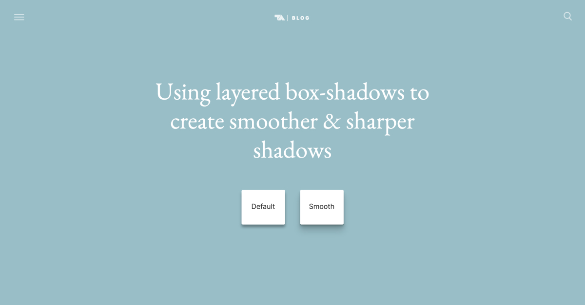
Creating smooth and realistic shadows in CSS
TL;DR Use multiple CSS box-shadow's on top of each other to create smoother, more realistic looking shadows.
/* Default box-shadow */
.box {
  box-shadow: 0 3px 3px rgba(0,0,0,0.2);
}

/* Create smoother box-shadows by layering multiple
 * shadows with gradually increasing radius and offset */
.shadow-5 {
  box-shadow: 0 1px 1px rgba(0,0,0,0.12),
              0 2px 2px rgba(0,0,0,0.12),
              0 4px 4px rgba(0,0,0,0.12),
              0 8px 8px rgba(0,0,0,0.12),
              0 16px 16px rgba(0,0,0,0.12);
}
The excellent full article from Tobias Ahlin:
Smoother & sharper shadows with layered box-shadows
With a simple CSS trick, we can get fine-tuned control over how shadows are rendered, and create richer and more realistic 3D effects
Visual editor by Philipp Brumm:
brumm.af
Web site created using create-react-app